Website Systems · Brand Systems · Campaigns & Content
Empee: Rebuilding a Wholesale Fabric House for the Way It Actually Sells.
B2B e-commerce relaunch, brand identity, and digital marketing strategy.
Client
Empee Textiles Ltd.
Industry
Wholesale Textiles · B2B
Year
2026
Location
United Kingdom
Overview
Empee had thirty years of trade relationships and none of it showing up online. Buyers who'd been reordering the same linens and canvases for a decade were still shopping a flat product catalogue with no memory of who they were — no saved pricing, no reorder shortcuts, no sense that the business on the other end of the browser had any idea who they were talking to.
Scope
- Shopify B2B relaunch
- Brand identity
- CRM & analytics implementation
- Go-to-market strategy
- Email & SMS automation (Klaviyo)
- Behavioural analytics (Lucky Orange)
The Brief
Two problems, one coherent thing.
Empee had thirty years of trade relationships and none of it showing up online. Buyers who'd been reordering the same linens and canvases for a decade were still shopping a flat product catalogue with no memory of who they were — no saved pricing, no reorder shortcuts, no sense that the business on the other end of the browser had any idea who they were talking to.
The ask was twofold: rebuild the commerce experience around how wholesale buyers actually behave, and give the brand a visual identity that felt like a considered textile house rather than a template. Two very different problems that needed to land as one coherent thing.
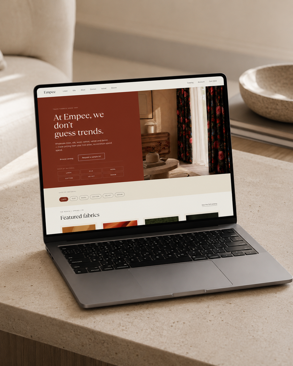
Homepage — the corrected identity in situ. Rust and deep olive doing the work, cream holding the space, textile photography carrying the register.
Audience
Starting with who's actually buying.
Wholesale doesn't have one customer — it has five, and they want almost nothing in common:
— VIP accounts: high-volume, long-standing, expect priority access and bulk-order tooling.
— Regular purchasers: consistent order patterns, want speed and template reordering above all else.
— Occasional buyers: seasonal or project-based, respond to timing and reminders, not urgency.
— Dormant accounts: gone quiet after 6+ months, still active businesses, just need a reason back in.
— New prospects: the right industry profile, no relationship yet, need education before they need a catalogue.
Rather than design one homepage and hope it worked for all five, we designed the system first: what each segment sees on login, what triggers an email, what a dashboard prioritises. A VIP account opens to bulk-order tooling and a dedicated contact. A regular purchaser opens to 'reorder your last shipment' in one click. A dormant account gets a win-back sequence, not a generic newsletter. The homepage isn't one page — it's five, quietly.
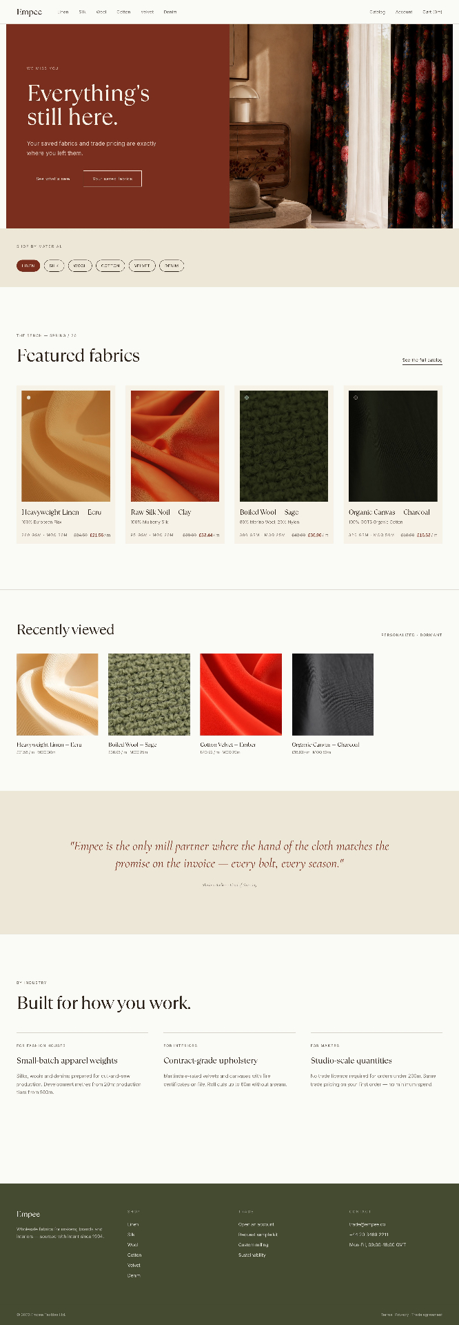
Segmented homepage — a dormant account doesn't see the same store a regular buyer sees. Win-back messaging in the buyer's own colours, saved fabrics one tap away.
Commerce
The commerce experience.
The redesign centred on a small number of changes that mattered more than they look:
— One-click reordering for standing orders — the single most requested feature from existing trade accounts.
— Clean product cards that surface the numbers a buyer actually decides on — GSM, MOQ, composition — instead of burying them in a description tab.
— Category-led navigation replacing a cluttered mega-menu, so Linen, Silk, Wool, Cotton, Velvet and Denim each behave like their own considered shop.
— A mobile experience built for the loading dock, not just the office — buyers checking stock and reordering from the floor, not a desk.
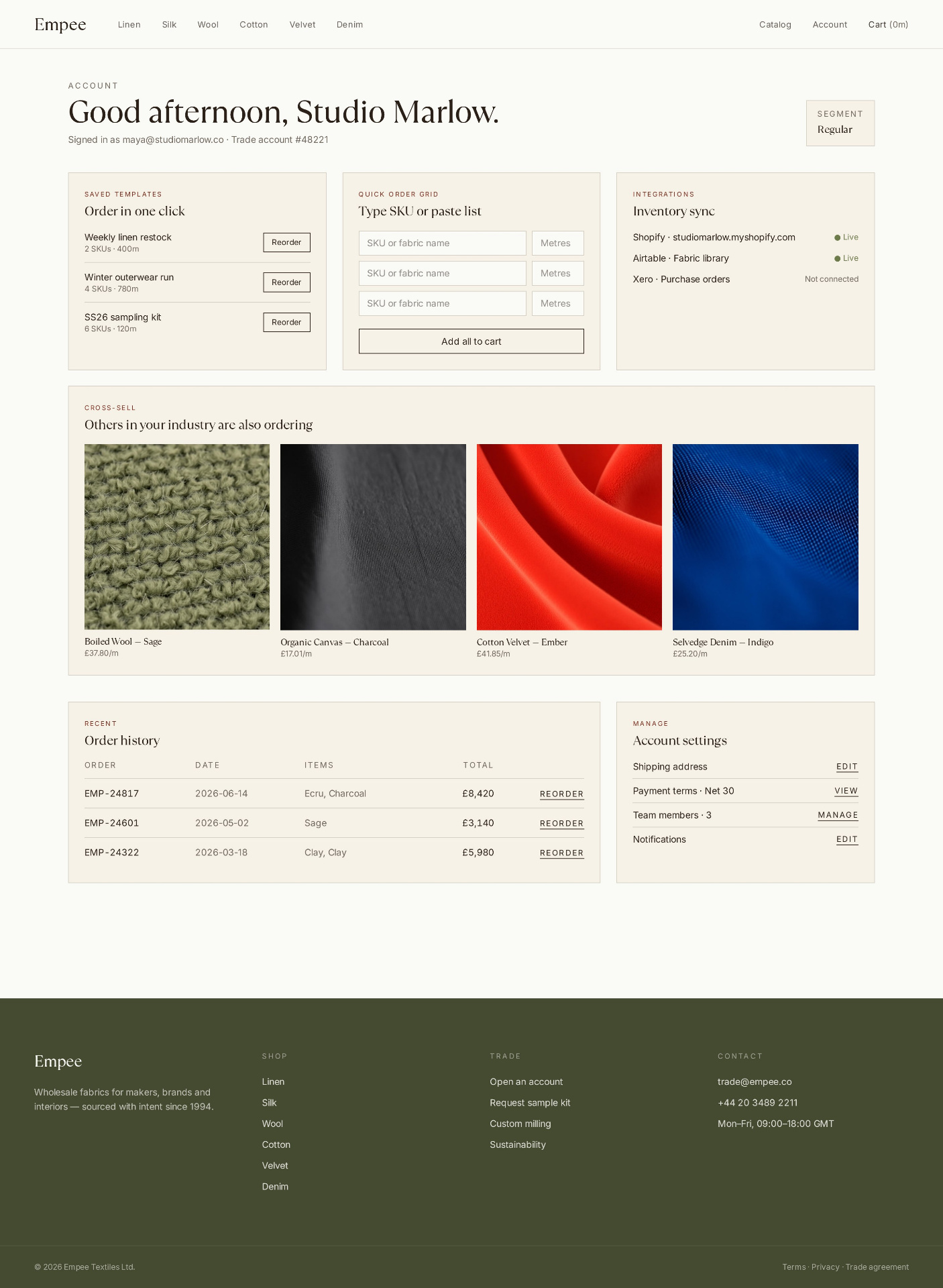
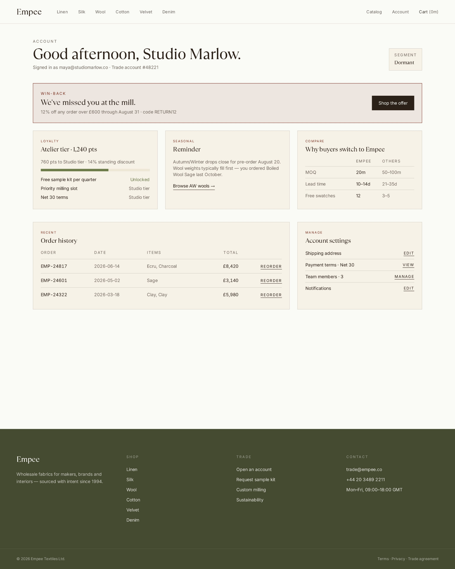
Account dashboards — same architecture, two conversations. A regular purchaser opens to saved templates, quick-order grid and inventory sync. A dormant account opens to a win-back offer, loyalty status and a reason to come back.
Identity
Brand and visual identity.
The existing site had drifted into a single flat beige — safe, but indistinguishable from any other fabric supplier's Shopify theme. Empee's own marketing materials told a richer story than the site did: oxblood and moss from the seasonal banners, and a genuinely distinctive illustrated mark from their social presence, built around a botanical 'e' logotype.
We rebuilt the palette from those existing assets rather than inventing a new one — cream and warm ink as the base, rust and deep olive as the two colours doing the real work, sage and tan held back as detail rather than décor.
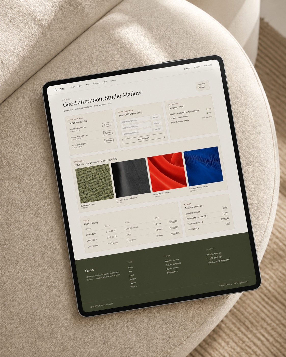
On tablet — the quick-order grid, saved templates and inventory sync collapse into a single loading-dock-ready surface.
Typography
Correcting the register.
The typography went through a parallel correction: an early pass leaned on a rounded, casual script for annotations and pull-quotes, which read closer to a farmers-market label than a trade house with thirty years behind it.
Swapping to a thin italic serif, removing every tilt and flourish, and letting a single hairline stamp carry the 'Est. 1994' heritage marker instead of a decorative badge brought the identity in line with the register Empee actually wanted: closer to a considered English tailoring house than a craft stall — quiet colour, confident restraint, nothing shouting for attention.
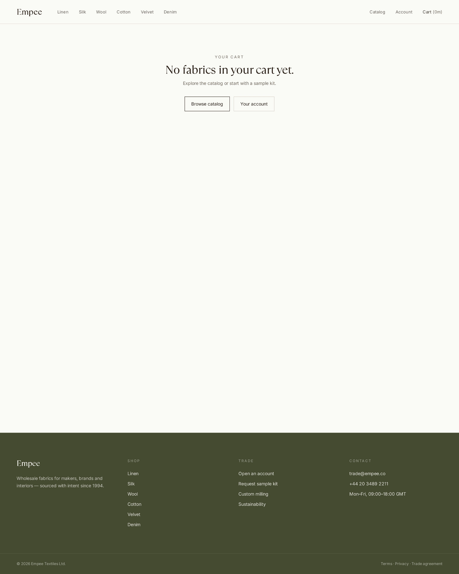
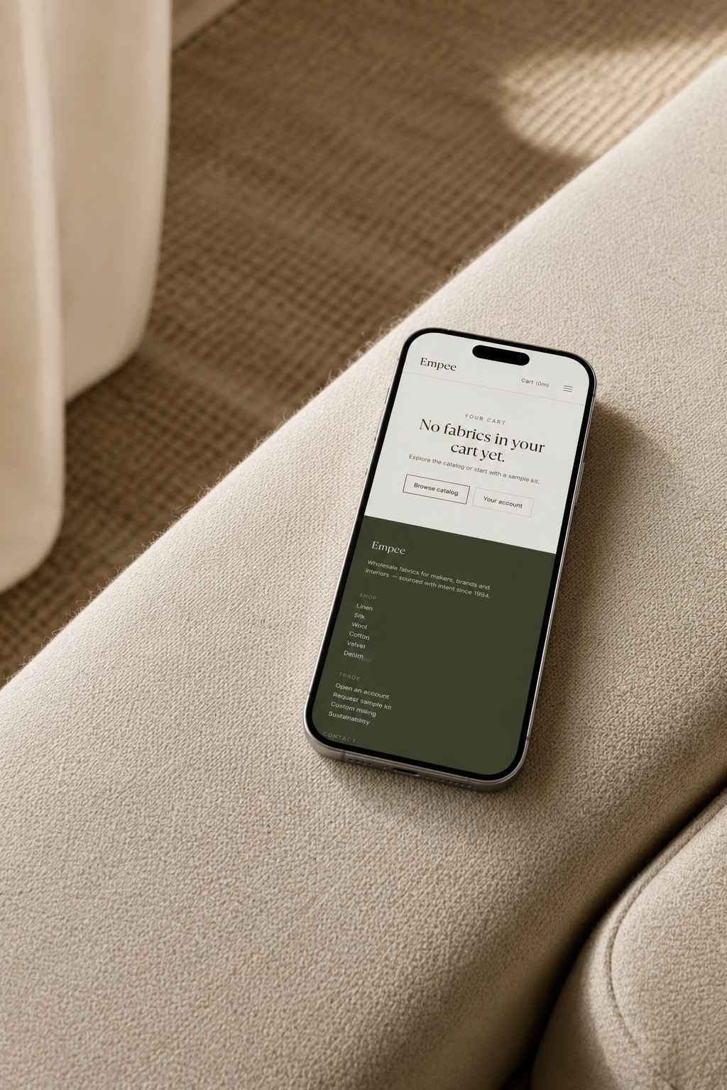
Cart — considered restraint carried all the way to the empty state. Two clear routes forward, no upsell noise.
Marketing
The marketing system behind the site.
A better website is only half the job if nobody comes back to it. We built the retention and acquisition layer around two tools:
Klaviyo for segmented email and SMS — automated flows keyed to each customer category, cart abandonment recovery, reorder reminders timed to historical purchase cycles, and dynamic content blocks that change depending on who's reading.
Lucky Orange for behavioural analytics — heatmaps and session recordings on the pages that mattered most, exit-intent surveys to catch abandonment reasons in the buyer's own words, and funnel analysis segmented by customer type rather than averaged across all of them.
Pre-launch (Month 1) — Teaser campaign, countdown, early access for VIP accounts, tutorial content.
Launch (Month 1) — Multi-channel announcement, incentivised migration, first-order discount.
Post-launch (Months 2–6) — Personalisation rollout, custom dashboards per segment, tailored recommendations.
Optimisation (Months 7–24) — A/B testing, cart abandonment reduction, search enhancement, bulk pricing expansion.
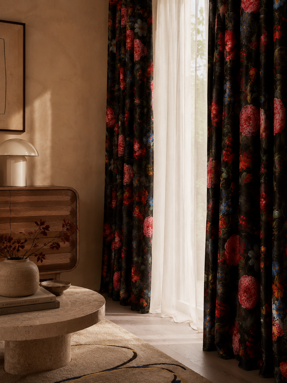
Where the fabric lives — the interior photography Empee's palette was pulled from.
Measurement
Measuring what mattered.
Success was tracked across three metric groups rather than a single conversion number: conversion (rate improvements, cart completion, abandonment), engagement (session duration, feature adoption, return visits), and revenue (average order value, customer lifetime value by segment).
Budget was weighted accordingly — 30% to email marketing and automation, 20% each to analytics tooling, content, and paid advertising, and the remainder to training so the team could run the system after handover rather than depend on us to operate it.
Targets were set in stages rather than as one distant goal: a 15% conversion lift at six months, 30% at twelve, building to the full 50% two-year target the project was scoped against.
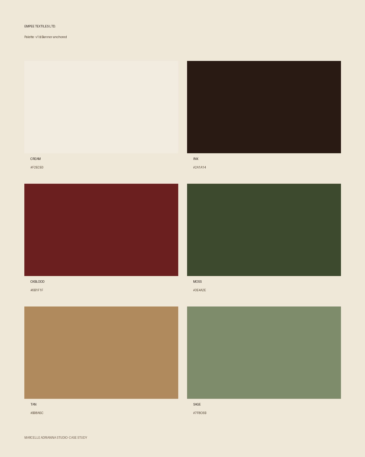
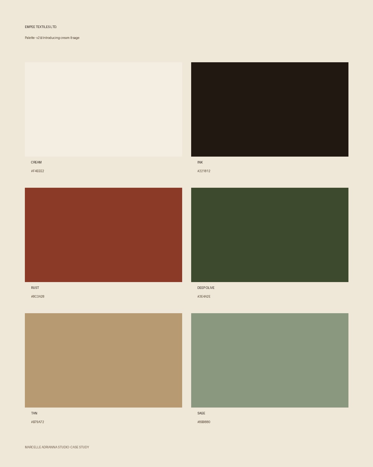
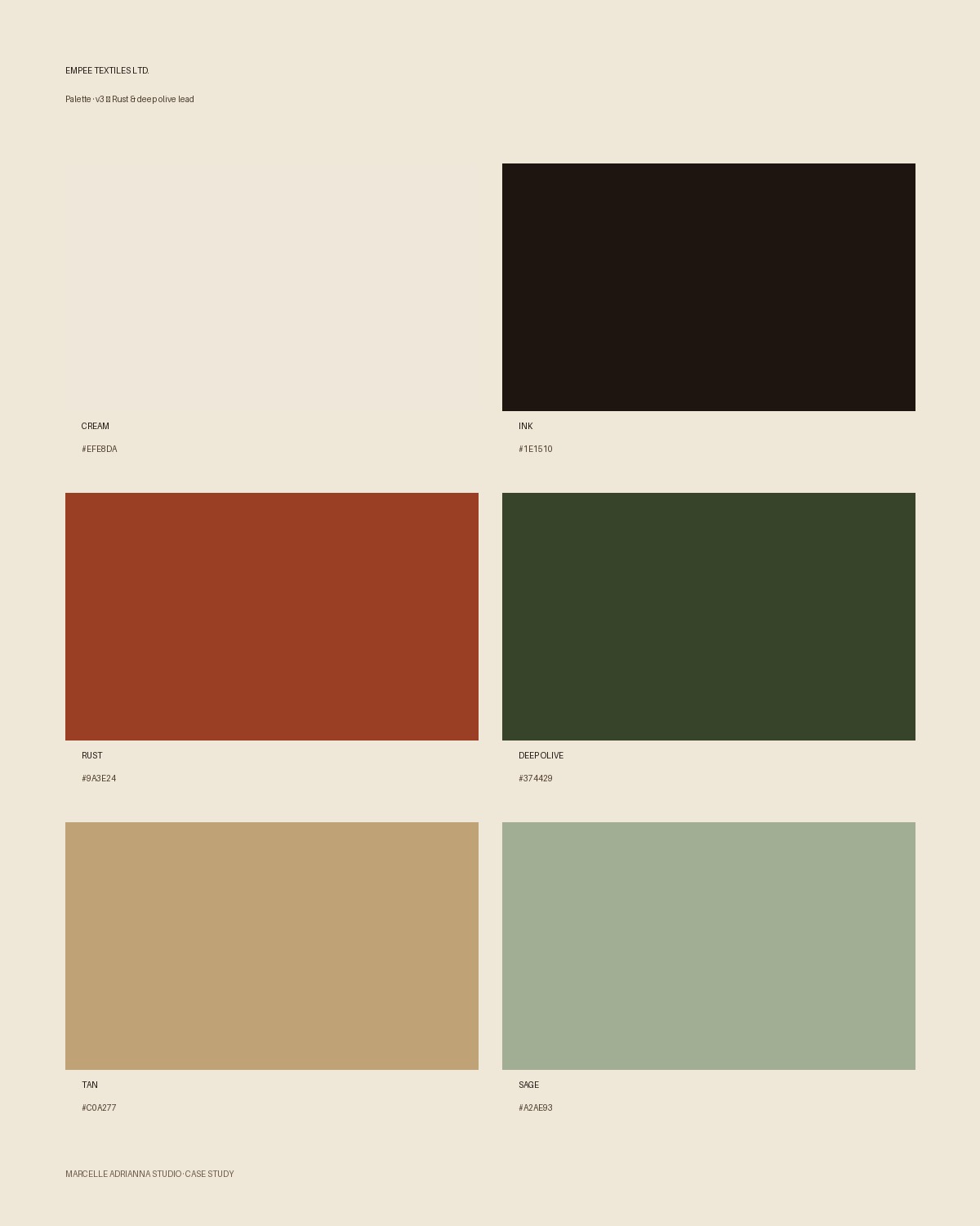
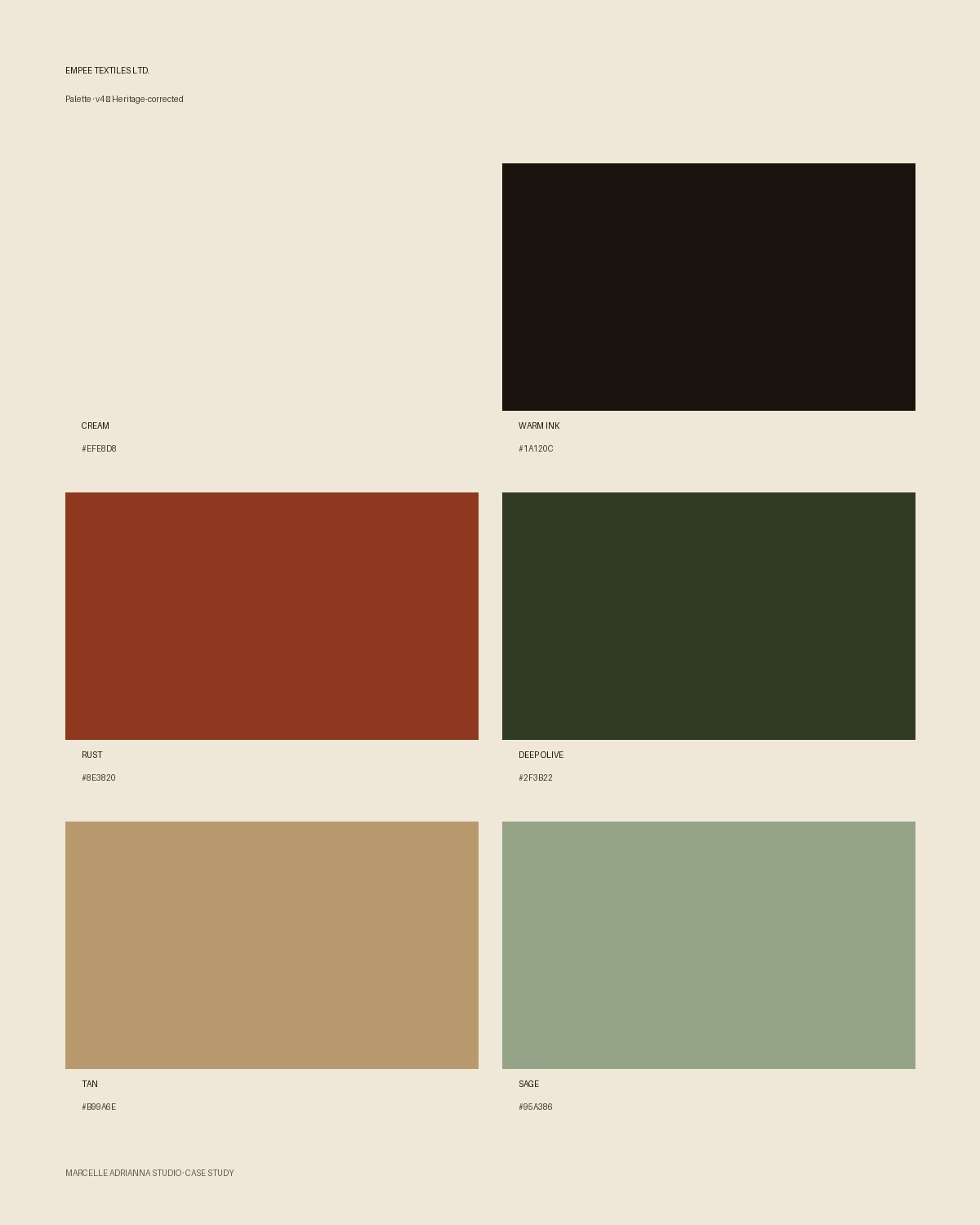
Palette development — from the original banner-led direction through to the corrected, heritage-weighted system.
Closing
Thirty years, one coherent house.
Empee went from a site that treated every buyer identically to one that recognises a VIP account, a first-time prospect, and a dormant customer as three different conversations — while looking, for the first time, like the fabric house it actually is: thirty years of trade relationships, a distinctive identity pulled from its own archive rather than a template, and a commerce experience built around how wholesale actually gets bought.
Deliverables
- Shopify B2B relaunch
- Segmented account dashboards (VIP, Regular, Occasional, Dormant, Prospect)
- One-click reordering & standing-order tooling
- Product card system (GSM, MOQ, composition)
- Category-led navigation (Linen · Silk · Wool · Cotton · Velvet · Denim)
- Brand identity system (palette, typography, botanical mark)
- Klaviyo email & SMS automation
- Lucky Orange analytics & funnel tooling
- Team training & handover
Outcome
A wholesale fabric house that recognises a VIP, a prospect and a dormant account as three different conversations — with staged conversion targets of 15% at six months, 30% at twelve and 50% across the two-year plan.
More work


