Campaigns & Content · Art Direction
A creator merch line, art-directed like an editorial campaign.
Shoot direction and campaign system for the Brain Energy merch launch.
Client
Hayley Morris
Industry
Creator · Merch · Campaign
Overview
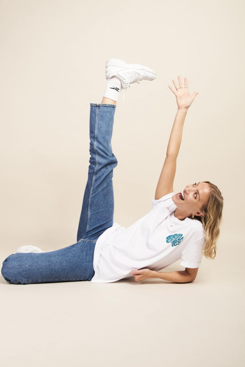
Hayley Morris built an audience on personality — a cast of characters, sharp comedy and a distinct point of view. For the launch of the Brain Energy merch line, we wrote the shoot direction: a full creative treatment that translated that on-camera energy into a still and moving campaign the team could actually go and shoot.
Scope
- Shoot direction
- Creative concept
- Mood & colour direction
- Posing direction
- Location & lifestyle scouting
- Product art direction
- Video reference & motion cues
Brief
Play off the personality — don't sand it down.
The brief was direct: build a shoot that represents Hayley's personal brand well. Fun, playful posing, and enough range of moods to hold the different characters she plays into.
The treatment had to serve two masters at once — product-first ecommerce imagery that could run flat on a store, and lifestyle-led editorial imagery that could carry the campaign on social and email.
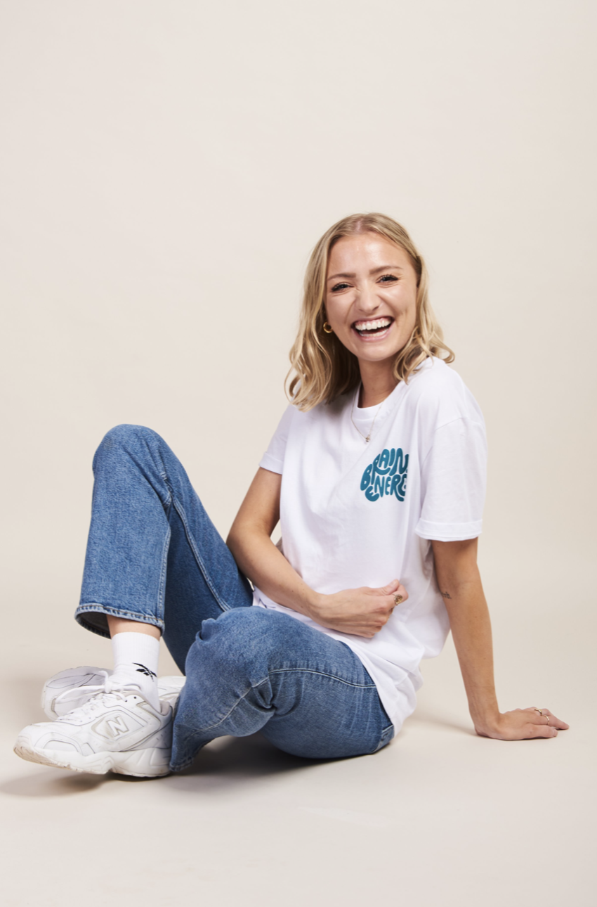
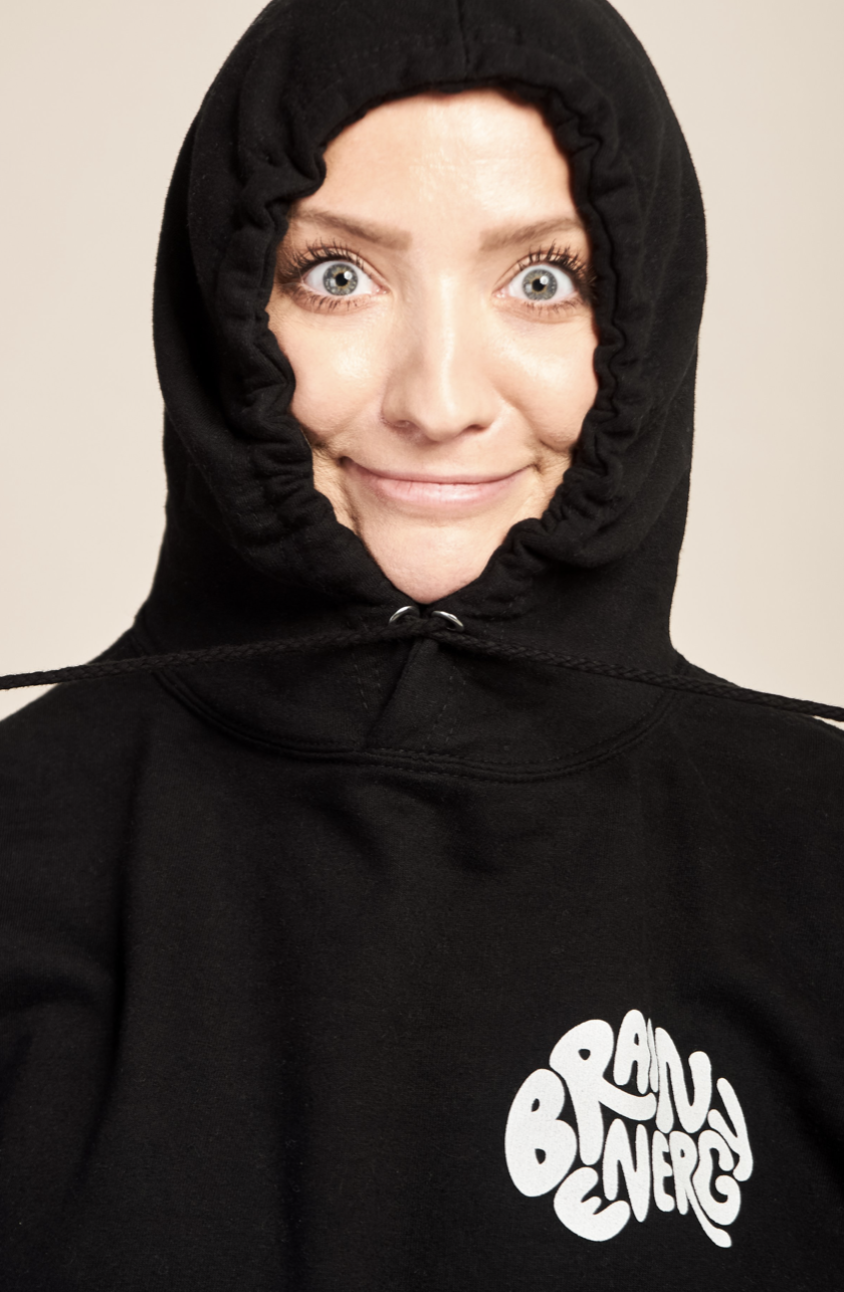
Final campaign — Brain Energy shoot.
Colour Direction
Neutral core, with pops of merch colour.
The core palette is intentionally quiet — soft neutrals that let the retro, playful merch typography carry the personality. This gives every product shot a calm base and keeps the line reading as one collection rather than a set of one-off drops.
For the lifestyle blocks, we introduced a darker green as a controlled counterpoint — enough colour to feel like a mood shift, restrained enough to stay on brand.
Mood
Between ecommerce and editorial.
The mood board is built as two conversations. On one side, clean neutral-toned portraits designed to sit on a product page. On the other, softer, more editorial frames — sitting, crouching, mid-laugh — that give the campaign somewhere to breathe. Together they cover the full range from PDP to feed.
Posing
Character work, not catalogue.
The posing direction leans into Hayley's on-camera range: hands on hips, arms raised, mid-jump, mid-laugh, and quiet close-ups. Each pose is mapped to a mood so the shot list produces a rhythm — energy, calm, energy, calm — instead of one flat register.
Location
A lifestyle setting to anchor the campaign.
A single considered lifestyle location gives the campaign a home. Not a studio white-cyc, not a location cliché — a set that feels lived-in, warm and photograph-ready, so the same environment can hold multiple looks across the shoot day.
Product
Front, back, detail — every SKU, one language.
The product direction covers the full Brain Energy range: hoodies, t-shirts and sweatshirts across the merch colourway. Each garment gets front, back and detail shots framed to a single visual grammar so the collection reads as one system on the store.
Folded stacks, sleeve details and label close-ups sit alongside the on-body imagery — enough texture and material information to sell a garment without needing to describe it.
Motion
VHS-tinted film, in Hayley's voice.
The video direction sits deliberately close to the stills — a slight VHS film treatment, quick cuts, and the same character range as the posing brief. The intent is a piece that plays on the feed like a Hayley reel, not a merch ad.
Deliverables
- Creative treatment & shoot direction
- Colour & mood board
- Posing direction
- Location & lifestyle brief
- Product shot list (front / back / detail)
- Video reference & motion cues
Outcome
A shoot direction the production team could pick up and execute — one clear treatment holding ecommerce, lifestyle campaign and motion under a single visual language, in Hayley's voice.
More work


