Brand Systems · Campaigns & Content
Sandstone, black ink, no noise
A full identity and packaging system for a renovated boutique villa hotel in Seminyak, Bali — from amenity labels to menus and in-room signage.
Client
Villa Massilia
Industry
Hospitality · Boutique Hotel
Overview
A full identity and packaging system for a renovated boutique villa hotel in Seminyak, Bali — from amenity labels to menus and in-room signage.
Scope
- Brand Identity & Packaging
The brief
The brief
The owners were mid-way through a complete renovation of a three-villa estate in Seminyak and needed a brand to arrive with the building. The reference wall was Casa Cook — lighter, because of the natural Palimanan stone going in — with Aman's restraint and Scorpios Mykonos' looseness named in the same paragraph. Stage one was the guest amenity range and stationery; stage two, the menus, wine list and in-room literature. Everything had to be printable at a local Bali press.
The contradiction in the brief was the actual problem to solve: clean or typewriter, luxury or laid-back. Resolving it stylistically would have meant picking a side. Resolving it materially did not.
Two directions, one decision
Two directions, one decision
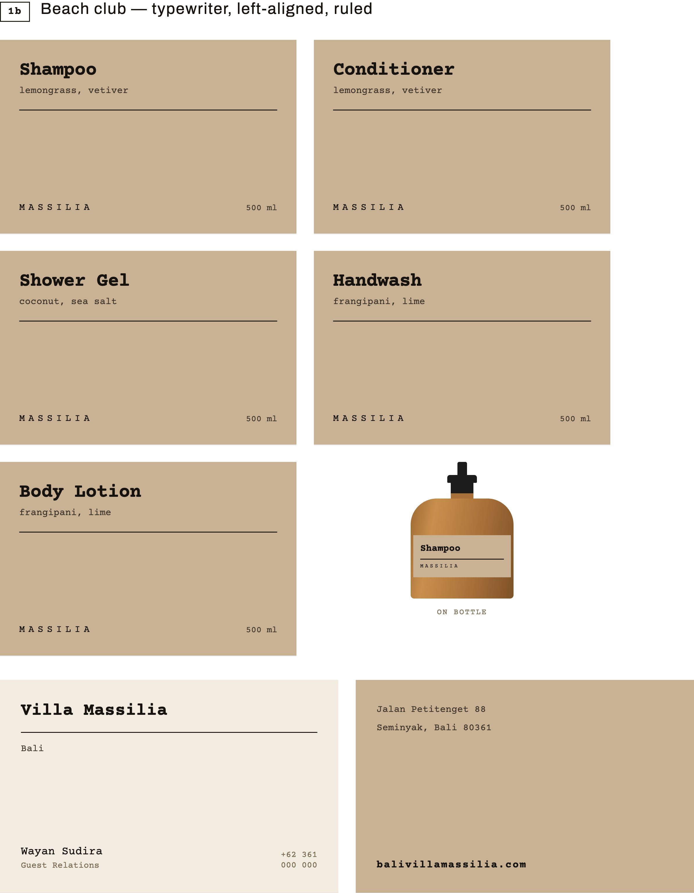
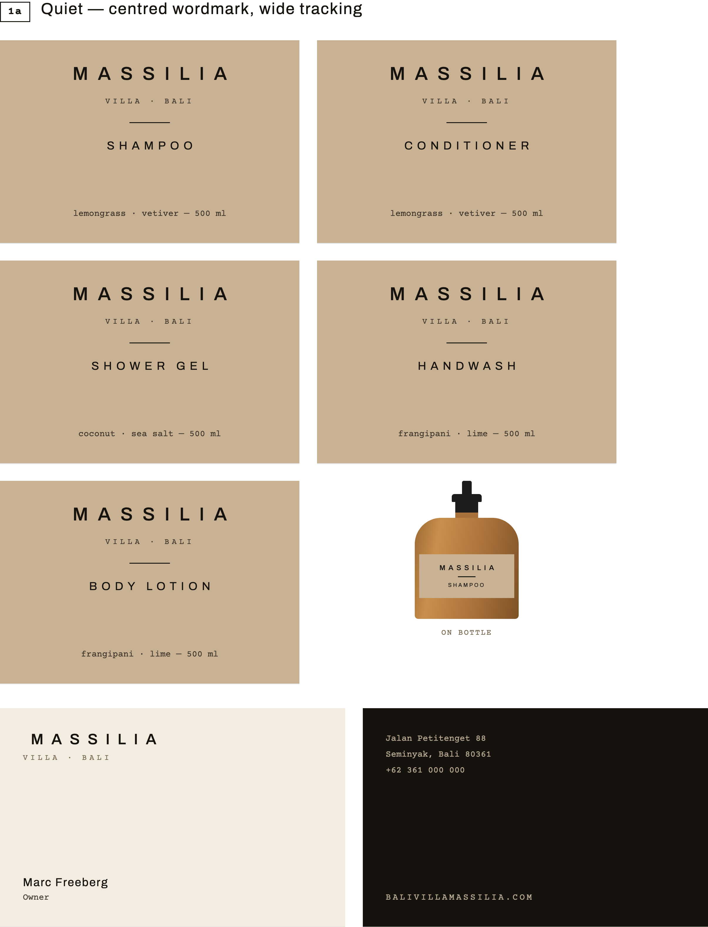
Rather than a moodboard, both readings of the brief were drawn as finished artwork on the real stock. A quiet direction — centred, wide-tracked caps, the Aman end of the reference. A typewriter direction — left-aligned, ruled, monospaced, closer to Scorpios. Same grid, same ink, same paper, so the choice was about voice and nothing else.
The quiet direction carried the range; the typewriter voice was kept for the menus and in-room cards, where a little looseness earns its place. One system, two registers.
Direction A, quiet — the direction that carried the range
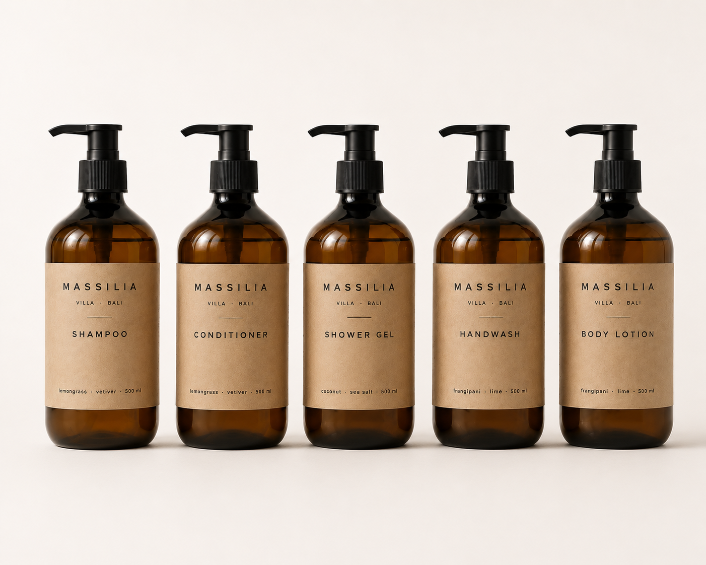
One label, five products
One label, five products
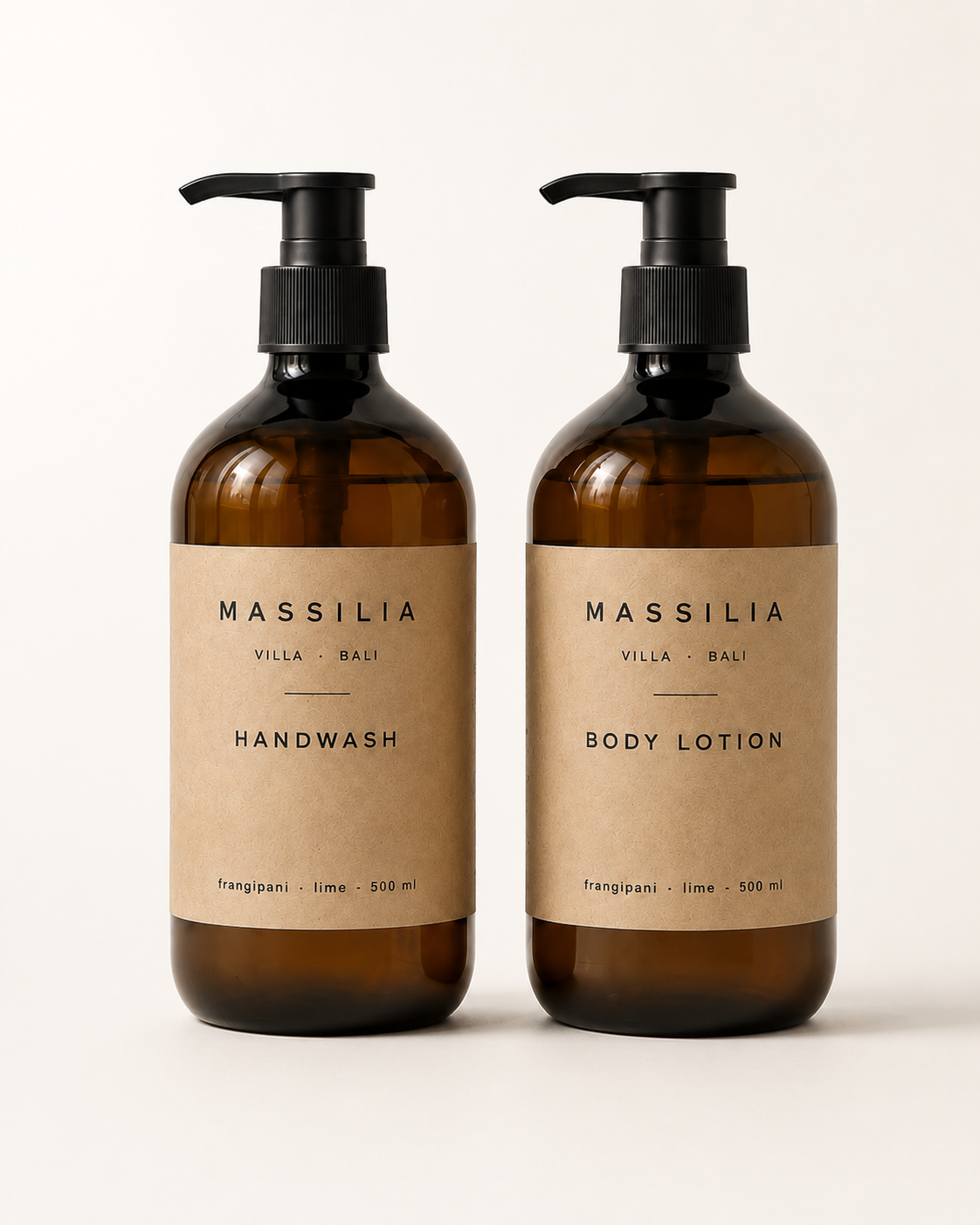
Shampoo, conditioner, shower gel, handwash and body lotion share a single kraft label; the product name and a two-word scent line are the only variables. Amber 500 ml PET with a matte black pump, so the range reads as one object on the shelf rather than five — and so a bottle can be re-labelled without a new artwork sign-off. Shampoolemongrass Conditionervetiver Shower gelsea salt Handwashlime Body lotionfrangipani
Built for a local press
Built for a local press
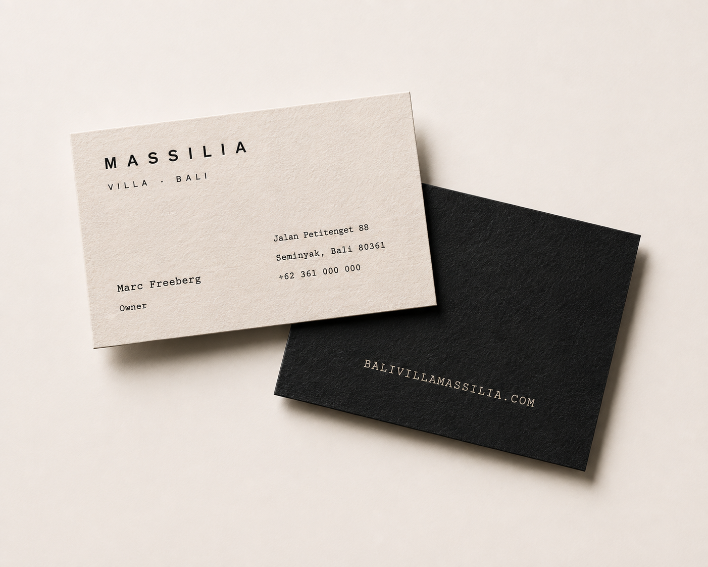
The print shop works in Corel Draw and prints one colour on uncoated stock. That constraint set the artwork: no foils, no gradients, no second pass, nothing that fails on a warm sheet. Type was sized to hold at label scale after the press gain, and every file was supplied in the formats the shop actually opens — CDR alongside PDF and EPS, with outlined type so no font travels.
1 colour2 stocks2 typefacesPDF · EPS · CDRType outlined
The property
The property
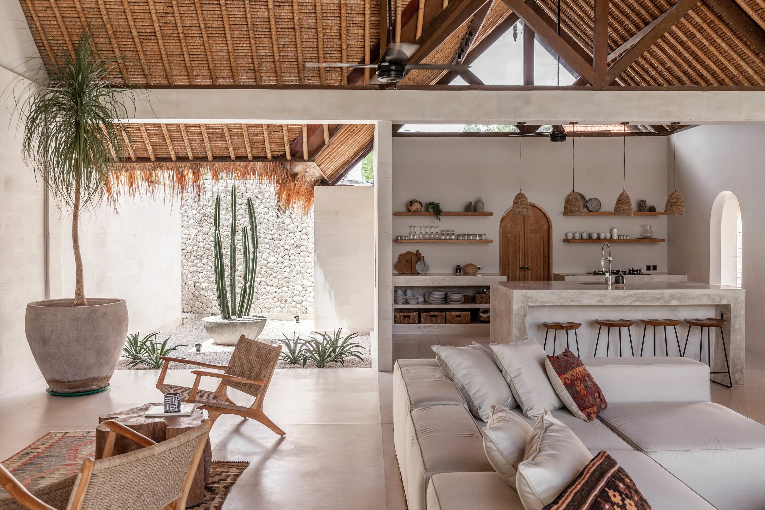
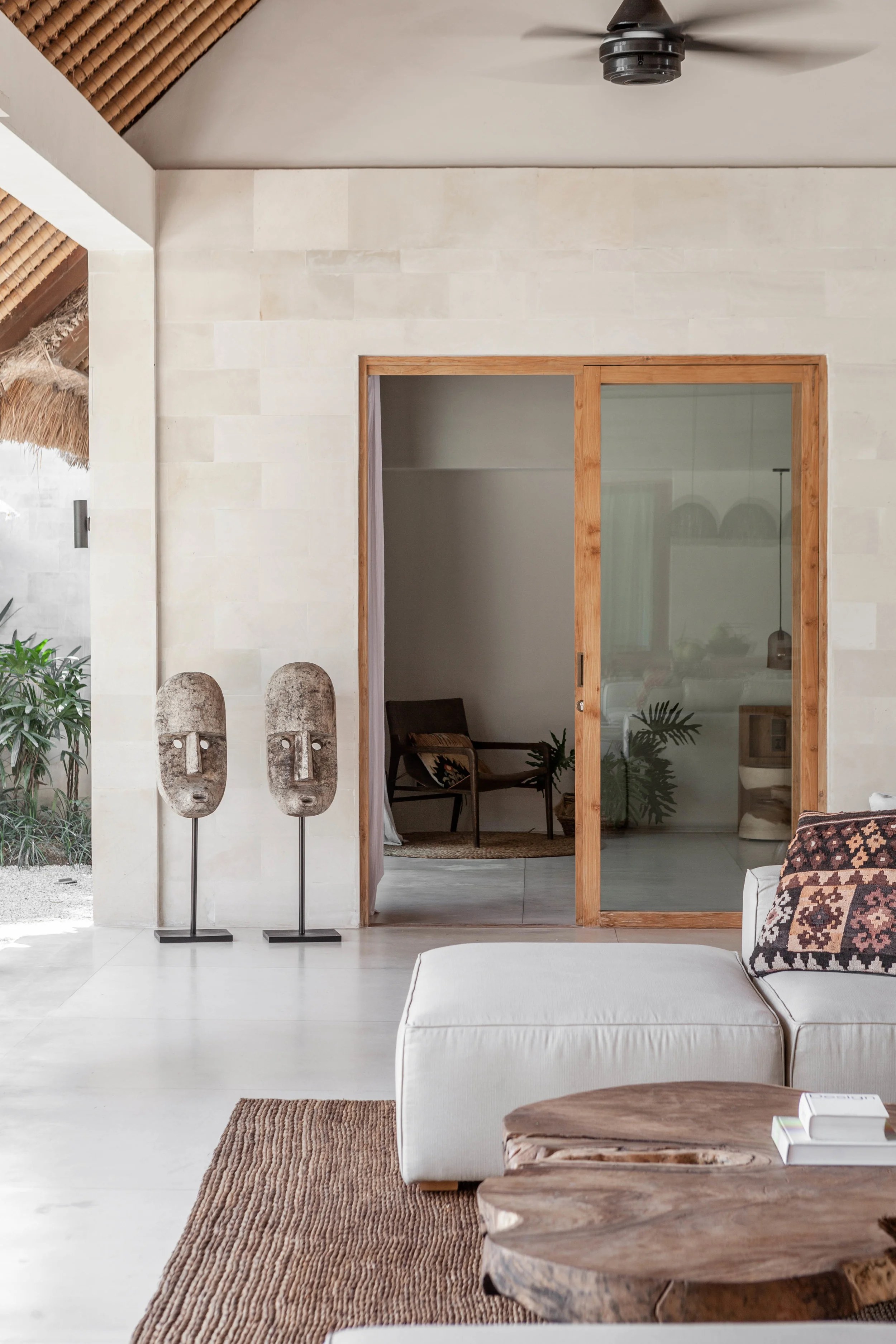
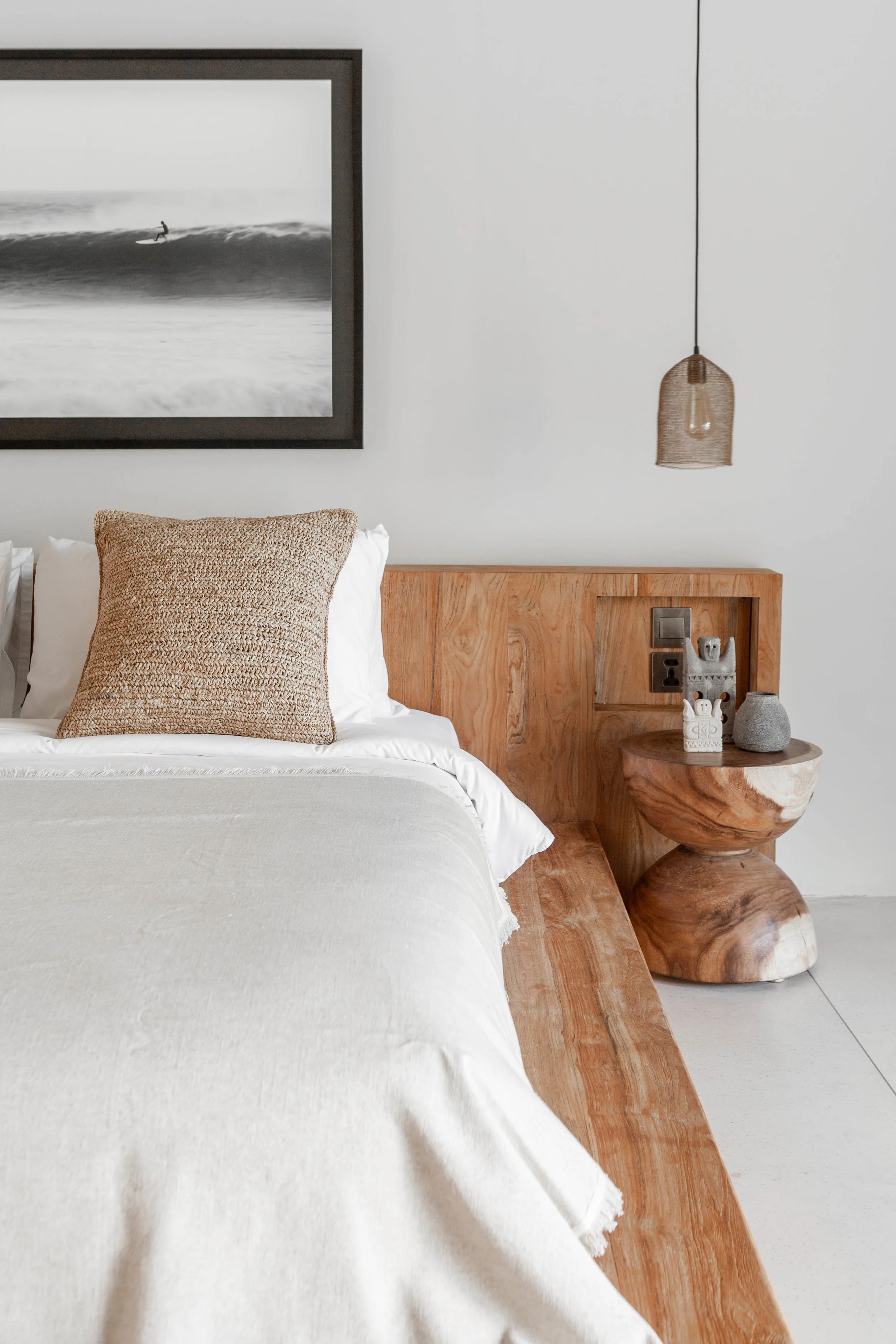
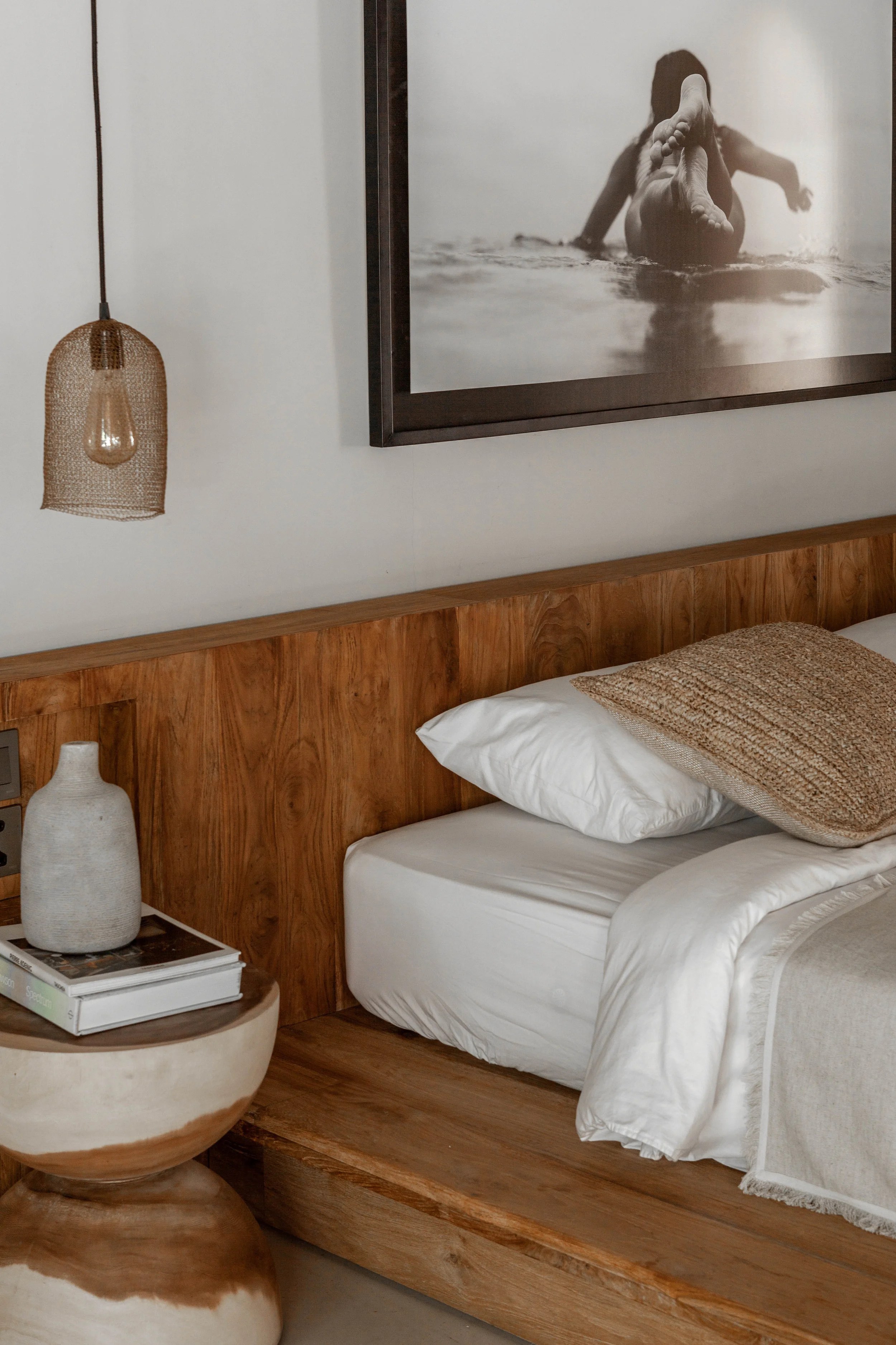
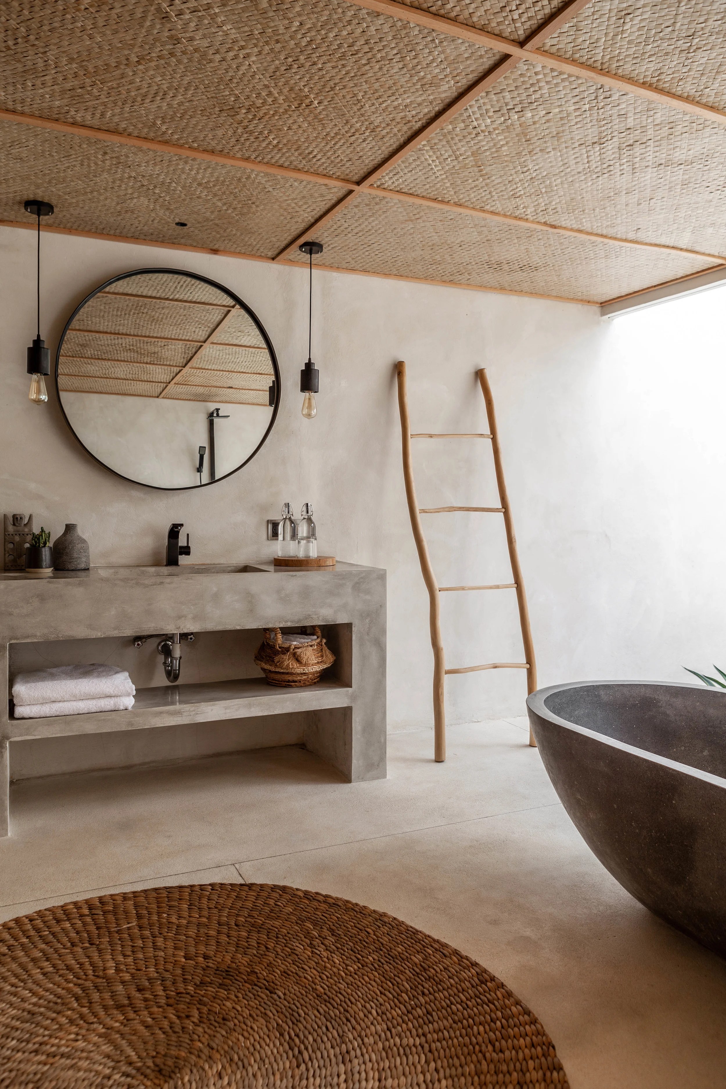
Three villas, ten bedrooms, one estate in the heart of Seminyak — alang-alang roofs, reclaimed teak, terrazzo and Palimanan stone. The palette was taken straight off the building, which is why the labels disappear into the bathroom instead of competing with it.
Design and photography held by one pair of hands — the labels and the shots they live in were made together, not handed off.
01A five-SKU amenity range that prints one colour and still reads as luxury.
Deliverables
- Brand Identity & Packaging
Outcome
01A five-SKU amenity range that prints one colour and still reads as luxury.
More work


